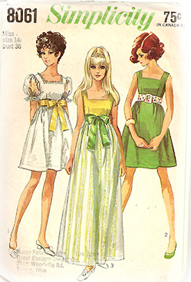
This is a bit random. And kinda silly. But I couldn’t resist!
The old pattern pictured below is one of my favorites (there’s no date on it, but I assume it’s from the fifties). I love it not only for the actual dress patterns inside, but also for the color scheme and the illustration style used. And you’ll see directly to the right of the pattern…is a text-ad that my husband designed for me to market my painting/mural/faux-finish business (it’s called Big Finish Interiors)—I mean, just look at the brilliant color-scheming that he’s done! I couldn’t help but notice the similarities. Such talent. Is it any wonder why I married him? And did I mention that he also kicks butt at photography? The evidence speaks for itself 🙂

In other news, I’m getting really excited about the growing list of projects that I’m working on. Which also includes updating the look of this-here-blog-thingy that you’re lookin’ at…! So I’ll have more photo-goodness in the weeks to come!


love it not only for the actual dress patterns inside, but also for the color scheme and the illustration style used.